Written in 2021
I'm a person who's very interested in all things design. I love to check out new logos and information about corporated identities in various blogs and news sites, and since I've always been a person who's rather focused on visual representation, I also always wanted to have a special logo for my website. Although, of course, I never was on par with real designers. But anyway, here are some iconic logos from rpg-o-mania through the ages.

This was the first logo this website ever had. 3D looks (especially animated) were very popular back then (you might remember those famous rotating "@" signs everywhere in the web).
As part of a multimedia magazine back in the day, I got hold of a software that allowed to create those 3D texts. Since I wanted to save bandwith, I decided not to animate the logo, and so all I did was write "RPG-O-MANIA" and created a 3D view from it, in plain blue.
This logo was only in use for the very first version of rpg-o-mania which lasted for some months from December 1998 to May 1999.
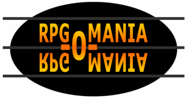
The second logo was one where I spent more time with it. I used it as an entrance button on the splashscreen the website had back then as so many websites had in the early 2000s. The logo just mirrored RPG and MANIA and made the -O- a central layout element.
There was also a version that I used on the main website, which encircled the O and crossed the two RPGs and MANIAs. However, this logo was also quite short-lived. I was a young lad who wanted to try out almost anything he saw anywhere on the web for himself.
The black circle with the grey lines referenced the design of the website itself back then.

This one was used for quite some time. Basically, it was just a font, written in italic, with some text. The three dots at the beginning and the end were a style cue that had been heavily used back then, when special characters showed that you just UNDERSTOOD the internet.
Over the years, the logo font changed. I started with "Verdana", which was a widely available font back then. In 2003, I changed the font to "Mac type", a free font that was similar to the MacOS system font at the time.
Even when the website was called "rpg-worldwide" for a short time, I still used the layout and style of the italic logo.
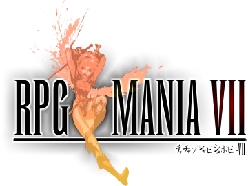
For a short period of time, I decided that I wanted to make a logo that mimicked the Final Fantasy logo style. I also followed a trend back then, since many websites used the font ("Runic MT condensed") and just wrote their websites' name like Final Fantasy and slapped a somewhat generic RPG image in the middle.
Well, I did the same, but there were two drawbacks about this logo: One, it now read RPG MANIA, without the -o- (which was stupid when the websites' domain is rpg-o-mania), and second, the image of Breath of Fire's Nina I used lacked most of her wings.
Trivia: This depiction of Nina can still be seen on some place around the website, but I've redrawn it myself some time ago. Ah yes, and the japanese text below the logo: That's just some random text I wrote to make it LOOK japanese. Which is a little bit pathetic.

This is basically just the italic logo again, but this time, I didn't use a premade font, but rather drew the whole logo myself. It is based on a box design with bars of identical length strapped together. The shortened bars of the letter are either 1/2 or 1/4 length.
The logo was then slanted to mimic the italic look. According to the corresponding trends of the times, I added or removed shadows, glow and other effects. In 2017, I redesigned the logo and removed the dots.
The logo, with all its noughties glory, looked dated after almost 20 years (including the italic logo), so I thought it was time for something new.
After I read some books for logo and typographic design (for instance "Stop stealing Sheeps" by Erik Spiekermann) and logs (like Designtagebuch by Achim Schaffrina), I thought it's time to put my amateurishly acquired knowledge to power and compose a new logo.
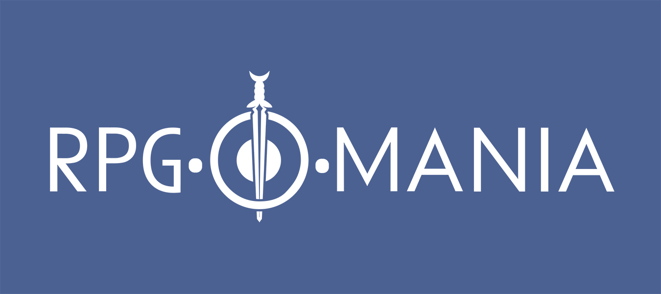
I wanted to create a logo that incorporates not only text, but an icon as well (that could be used anywhere, if need be). Using a logo with sword and shield is not uncommon amongst RPG sites or channels, but here, both have a second meaning.
The shield is being used as the letter "O", but not as abstract as in the Final Fantasy logo, but clearly distinctive now. And the sword is the sword on the coat of arms of my hometown, where most of rpg-o-mania has been created over the time.
The text is a slightly altered version of the font used for headlines.
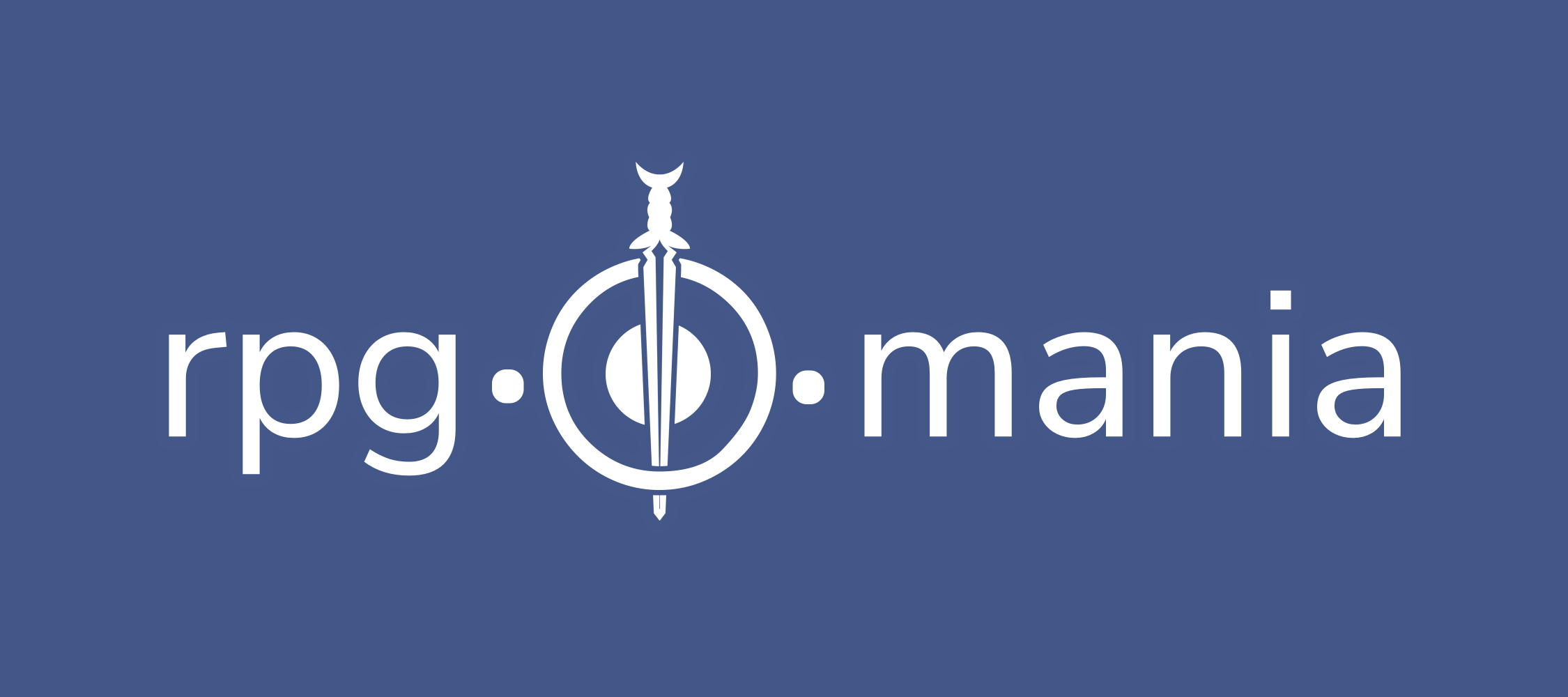
The logo was slightly altered in early 2023. The issue with the 2021 logo was that, even if it looked great, it didn't fit the self-referencing name of this website, which is rpg-o-mania in lower case letters.
So the sword and shield logo received a facelift where the letters were replaced with lowercase ones. This time, the letters themselves weren't altered and they're just like the regular headlines on this website.